


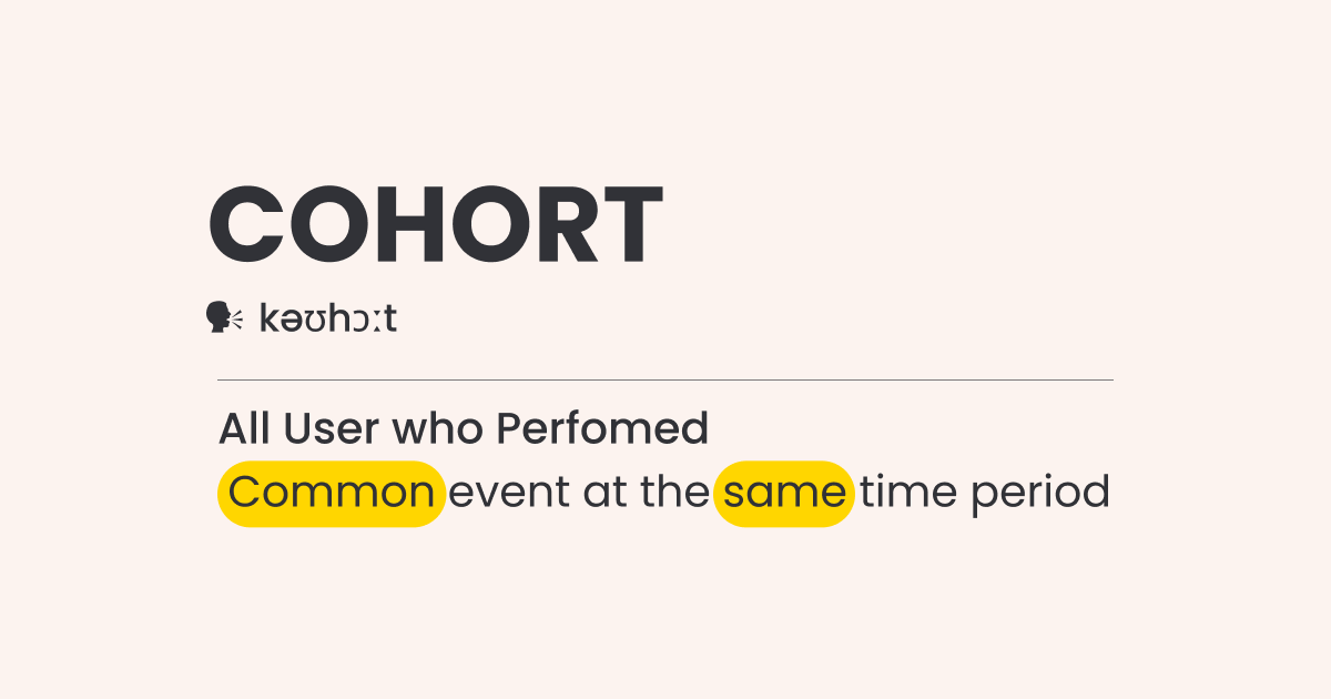
A cohort is a group of users experiencing a common event within the same time period. And a cohort analysis is when you try to derive insights from the behaviour of this group.
An example of a business cohort could be a group of users who made their first purchase through a mobile application during a specific promotional event, such as a Diwali sale. This cohort is defined by two key characteristics: the purchase channel (mobile app) and the timing of their first purchase (during the Diwali promotion).
Table Of Contents:
- What is Cohort Analysis?
- How do we employ this in business analytics?
- Benefits of Cohort Analysis
- Cohorts vs Segments
- Understanding customer retention
- Correlation between category and retention
- Features that correspond to maximum retention
- How customers react to a new feature release
- Creating Cohorts in Mixpanel, Amplitude, Adobe – First & returning event
What is Cohort Analysis?
Cohort analysis – a subset of behavioural analytics, take a selection of data from a larger data set, over a period of time, and instead of looking at all the users as one single unit, it segregates them into smaller related groups based on different types of attributes for analysis.
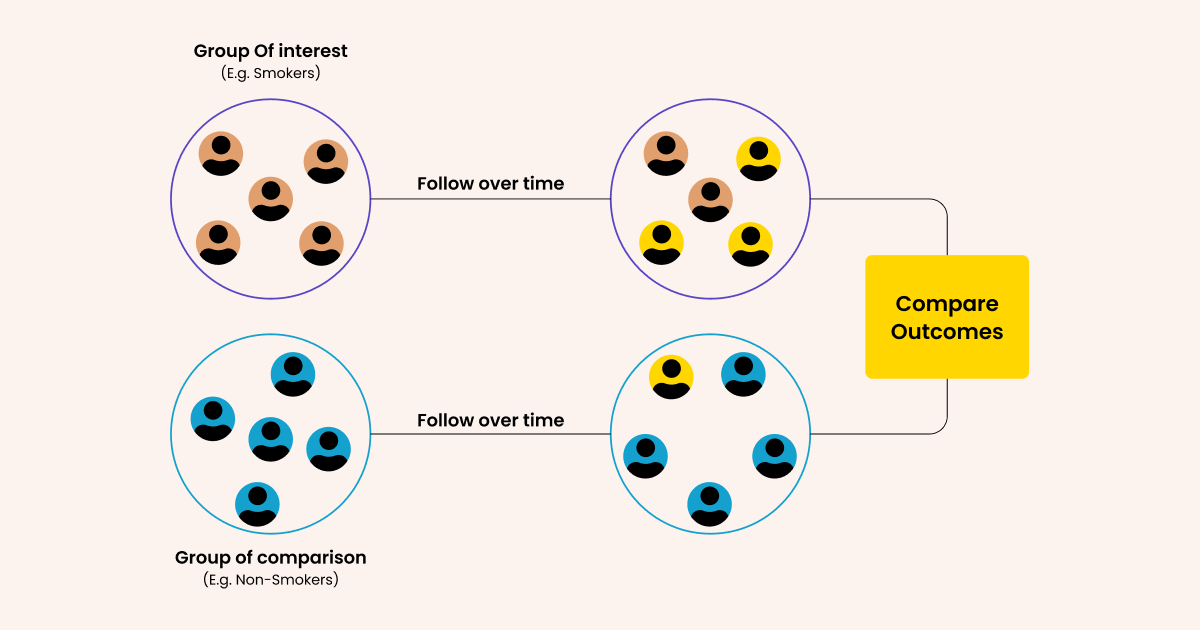
“In a prospective cohort study, researchers first raise a research question, forming a hypothesis about the potential causes of disease. The researchers then observe a group of people, the cohort, over a period of time (often several years), collecting data that may be relevant to the disease. This allows the researchers to detect any changes in health in relation to the potential risk factors they have identified.” via Medical News Study
So, to identify the cause of lung cancer doctors would create a hypothesis that it is caused by smoking. Then they will take two groups- smokers and non-smokers.
Thereafter, both groups would be studied to identify the influence of smoking on the person’s likelihood to get lung cancer.
How do we employ cohorts in business analytics?
In business applications, we compare cohorts – users sharing a common experience in a given time frame- or analyze the behavior of a single cohort, to identify a pattern that supports a growth hypothesis. That hypothesis could be anything.
For instance, we may create a hypothesis that users getting acquired via display ads have higher Customer Life time value (LTV) than the ones getting acquired by Facebook. To prove the hypothesis we could then do the cohort analysis.
Likewise, let’s suppose we want to identify the cause of the aggregate dip in your retention. So we would form a hypothesis that retention has a correlation with the first purchase of the customer.
To establish the relation we shall cohortize users on the basis of their first purchase and plot their, say, monthly retention %.
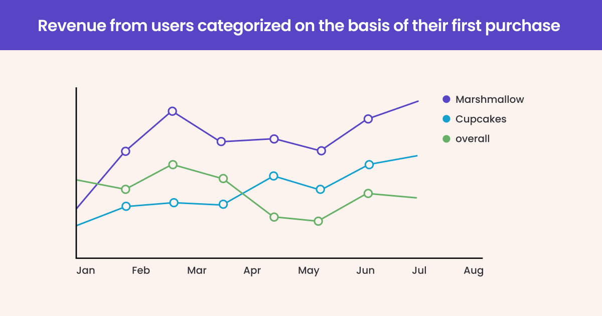
From the graph above it is apparent that the users who purchased marshmallows the first time displayed higher LTV than the others. This despite the fact that overall retention of the product has declined. Naturally, the intent of business now would be to get more users to purchase marshmallows post-acquisition.
Important – That’s not to say that Marshmallows are the cause of retention. Our analysis simply told us that there is a correlation between marshmallows and retention. Correlation doesn’t amount to causation. So we have to test if Marshmallows really amount to higher retention or not.
Cohort analysis gives us insight into the trend and basis for testing. Not the cause.
Benefits of Cohort Analysis
Cohort analysis is a powerful tool that provides valuable insights into customer behavior, enabling you to make informed decisions and drive growth.
Here are some key benefits of implementing cohort analysis in marketing strategy:
- 1. Understanding long-term customer behavior
Cohort analysis allows you to track and analyze the behavior of specific groups of customers over time. By grouping customers based on common characteristics, such as acquisition date or product usage, you gain a deep understanding of how their behavior evolves throughout their lifecycle. This knowledge helps you identify patterns, trends, and preferences and tailor your strategies and offerings accordingly.
- 2. Retention and churn analysis
One of the most significant advantages of cohort analysis in marketing is its ability to uncover insights into customer retention and churn rates. By examining business cohorts, you can identify when and why customers tend to disengage or churn. Armed with this knowledge, you can implement targeted retention strategies to reduce churn and enhance customer loyalty. This not only saves you from losing valuable customers but also contributes to long-term business sustainability.
- 3. Personalized marketing campaigns
By understanding the unique characteristics and behaviors of different business cohorts, you can create personalized marketing campaigns that resonate with each group. Tailoring your messages, offers, and promotions to specific cohorts ensures higher engagement and conversion rates, ultimately boosting your business’s revenue and profitability.
- 4. Product development and improvement
Through cohort analysis in marketing, you gain deep insights into how different business cohorts respond to changes or updates in your products or services. By observing the behavior and preferences of specific cohorts, you can identify areas for improvement and innovation. This knowledge enables you to make data-driven decisions when developing new features or enhancing existing ones, ensuring that your offerings align with customer needs and preferences.
Unlock your business’s potential with WebEngage Cohort Analysis!
Cohorts vs Segments
Most folks interchangeably use ‘Cohort’ and ‘Segment’ which is not correct as the two are not the same.
For two users to be part of the same cohort they have to be bound by the common event and time period. Eg 2017 graduates, 1990 born men.
However, to create a Segment you could use almost any condition as a basis that cannot necessarily be time and event-based. Eg graduates, men.
A cohort is a subset of Segment. So, there can be a cohort of ‘new users this week’ and likewise, there can also ‘segment of new users this week’.
Now that we have understood the fundamentals of cohorts, let’s understand some business use-cases.
Steps to Conducting a Cohort Analysis
Now that we have understood what cohort analysis is and how it will help your business, let us understand how to conduct it.
Step 1: Define your objectives
Before diving in, be clear about what you want to achieve with your cohort analysis. Are you looking to improve customer retention, evaluate the effectiveness of a marketing campaign, or understand purchasing behaviors? Setting clear objectives will guide the rest of the process.
Step 2: Identify Your Cohorts
Cohorts are groups of customers who share common characteristics or experiences within a defined time span. Decide how you want to conduct your business cohort segmentation. This could be based on their purchase date, the first use of your service, or their response to a specific marketing campaign.
Step 3: Collect the data
Gather the necessary data based on your cohort segmentation. This could include purchase records, user engagement metrics, customer feedback, or any other relevant data. Ensure the data is accurate and comprehensive to support effective analysis.
Step 4: Choose the right analysis tools
Select tools that suit your business needs and data complexity. This might be a simple spreadsheet for smaller datasets or more sophisticated analytics software for larger and more complex data.
Transform your business insights with WebEngage Cohort Analysis!
Step 5: Analyze the data
Start analyzing your data based on your objectives. Look for trends and patterns in customer behavior over time. For example, you might examine how long customers stay engaged with your product or how frequently they make purchases.
Step 6: Interpret the results
Once you have your data analysis, it’s time to interpret the results. Look for insights that align with your objectives. For instance, if you’re focusing on customer retention, identify at what point customers tend to drop off and what might be causing this.
Step 7: Take action based on insights
The ultimate goal of cohort analysis in marketing is to inform business decisions. Use the insights you’ve gained to make targeted changes, whether it’s tweaking your marketing strategy, enhancing your product, or improving customer service.
Step 8: Monitor and adjust
Finally, continuously monitor how the changes you implement impact your business. Cohort segmentation and analysis isn’t a one-time task; it’s an ongoing process. Regularly revisiting your analysis can help you stay on top of trends and adjust your strategies as needed.
Some powerful use-cases of Cohort Analysis
To explain the use-cases we have created a google sheet (linked below) where we have built the cohort chart for every use-case.
1. Understanding customer retention
But before we do that, a little throwback to how to read a cohort chart. We are skipping the data crunching part and jumping right into the presentation.
How to read a Cohort Chart?
Table 1
Link- Cohort by Active users – Sheet 1 | Excel
Let’s go through the rows and columns one by one. You could well see that column is for activation month and row is for the number of returning customers.
Rows
So, C5 represents the number of new customers we acquired in the month of Jan. D5 tells us the number of customers who were acquired in Jan but they returned in Feb. Likewise
E5- the number of customers acquired in Jan who returned in March.
F5- the ones who returned in April
And so on and so forth.
Basically, as we move along the Jan’s row, we understand how the retention of new customers acquired in Jan fluctuated until Dec.
Columns
Columns represents the number of returning or new customers. D5 represents the number of customers acquired in Jan who returned in Feb. E6 – the number of customers acquired in Feb who returned in March. D6 is the number of new customers acquired in Feb.
The same pattern repeats as we move along the row.
Table 2 (Refer Sheet – Cohort by Active users – Sheet 1 | Excel)
Now, let’s understand how each cohort, retention-wise, behaves over the period of time.
To do that, we would slightly pivot the above table. We would change the column from the actual month to the ‘# of months since acquisition’. From Jan, Feb to Month 0, 1, 2, and so on, which would pull all the row data to the left.
You may notice that the table changed from right-aligned triangle to left-aligned.
So, in the fifth row, as we move along, we would know how many customers acquired in Jan returned in the succeeding months.
Table 3 (Refer Sheet – Cohort by Active users – Sheet 1 | Excel)
In this table, we changed the numbers into a percentage to get a better view of the data.
We also see that 1st and 2nd months (Month 0 and Month 1 respectively) seem to be very critical, as churn increased remarkably beyond that (denoted by the dip in overall retention %).
Now looking at each row we may get the retention curve of the corresponding month. However, what if we want to understand how the retention has been over the past 12 months?
So, in the final row, we have calculated the aggregate. The aggregate gives us the retention curve of the past 12 months.
2. Correlation between category and retention
A friend of mine had worked on the cohort analysis of one of the world’s largest retailer. He told me that one of the conclusions from their analysis was that the users who purchased baby products in their first visit showed a higher propensity to visit again. This prompted the retailer to promote their baby section more aggressively.
One can create a hypothesis that there are some categories that trigger maximum stickiness among users when they are the first purchase.
To determine that category let’s cohortize users on the basis of the category of their first purchase and plot their retention.
Link- Cohorts by Category – Sheet 2
From studying the chart, one can draw the following conclusions:
- Users buying Sportswear in the first purchase showed higher retention than the rest.
- Users buying Jewelleries in the first purchase showed the lowest retention rate.
- 1st month is critical as the churn seems to increase beyond that.
Some possible inferences can be that the marketing expense for sportswear needs to be decreased. Likewise, the retention strategies for Jewellery purchasers need to be relooked. Retention strategy for users entering the 5th month since their acquisition has to be evaluated.
3. Features that correspond to maximum retention
A report by Quettra shows that an average app loses 77% of the Daily Active Users (DAUs) within 3 days post-install. Now, if your product itself isn’t deserving, then nothing can evade uninstalls. However, if it is not, then apparently the first three days are critical and determinant of the user’s retention.
3 days was the average trend and your critical number could accordingly vary.
You could determine your own critical number through the method that we discussed in #1.
Let’s suppose it is x days for the time being. Then you have to do something within the first x days post-install to hook users.
How cohort analysis comes into the picture?
Let’s create a hypothesis that there are some features in the app which when used increases the stickiness among users.
Create an aggregate retention curve of the last 12 months as we did in #1.
Note – The retention curve of the mobile app, unlike a web-app, is going to decrease linearly because a web-app doesn’t need to be installed on your device. A user can log in any time he wishes. With a mobile app, once it is uninstalled you potentially lose the user forever.
Now, screen the users who have retained and jot down the features used by them on the first day. Suppose you are analyzing for an e-commerce app and concluded the following traits to be common among all retained users.
Let’s say “push notification clicked” and “added to wishlist” are two most common actions
Now we would narrow our analysis for both of these events and do a comparison between them
The result
Cohort Analysis | Cohort by Features
Visit the above sheet and change the value for each feature from the drop-down to see how the graph changes.
From the above chart, it would be clear that users who added-to-wishlist display a higher propensity to retain than the rest. The ones who clicked push notification perform even worse than the average.
Again, this graph gives us the correlation not the cause of retention.
P.S. This is a very interesting method and extensively used by consumer businesses. I just discussed the basic framework and there are various edges that can lead you to a more definite conclusion.
4. How customers react to a new feature release
Inversely the above cohort analysis could also be used to figure out what are the obsolete features that need some rework.
For instance, the cohorts curve of users who clicked on push notification fare poorly than the average retention curve. Push notification is obviously meant to complement your retention so the above chart prompts us to rethink our strategy.
Creating Cohorts in Mixpanel, Amplitude, Adobe – First & returning event
If you are using Amplitude or Mixpanel, or any of the similar products, to do your cohort analysis, these are the two fields that you have to specify for creating a cohort chart
- First event
- Returning event
Let’s see some examples:
The first event is the primary criteria to build the cohort – the ‘experience’ element in creating a cohort that we discussed in the very beginning.
Returning event is the baseline that you want to track for your users. In the above charts, retention has been the baseline of our analysis. In analytics, retention could be defined as ‘any event performed by the user’ on your platform.
Conclusion
Cohort analysis is a respite from vanity metrics.
At any time momentary growth can be bought which may give you temporary pleasure but cohort analysis allows to be cynical. It gives a very critical view of churn and doesn’t let it get masked by growth.
For instance, if you are investing in acquisition there can be an instant surge in the Monthly Active Users (MAUs) but high MAU is not the indicator of growth. Cohort analysis will tell how many of those acquisitions are actually sticking with you.
Similarly, a particular channel might be amounting to the highest acquisition. But a cohort analysis will tell which of them contribute to maximum profit.
Whatever your key app metrics be, you would be able to see how it evolves over the customer lifecycle or product lifecycle.
Uncover hidden customer insights with cohort analysis. Book a demo to learn how WebEngage can help.
FAQ
1. What is cohort analysis and why is it important?
Cohort analysis is a type of behavioral analytics that groups customers or users based on shared characteristics, allowing businesses to gain insights into their behavior over time. This approach is crucial as it helps in understanding patterns and trends within specific segments of your customer base.
For instance, it can reveal how long-term customers behave differently from newer ones or how users acquired through different channels respond to your services. By identifying these patterns, businesses can tailor their strategies, improve customer retention, and ultimately drive growth.
2. What is an example of cohort analysis?
Here is an example of how a cohort analysis works. Imagine an e-commerce company that wants to understand the purchasing behavior of its customers over time. They could create cohorts based on the month each customer made their first purchase.
For instance, one cohort might include customers who made their first purchase in January, another cohort of those who first purchased in February, and so on. The company can then track each cohort’s purchasing behavior over several months or years.
This analysis could reveal valuable insights, such as whether customers acquired during certain months have a higher lifetime value or if specific cohorts are more likely to make repeat purchases. It might also show seasonal trends in purchasing behavior, or how effective certain marketing campaigns were in attracting long-term customers.
By comparing these cohorts, the company can tailor its marketing strategies, improve customer retention efforts, and make informed decisions about stock and inventory based on expected buying patterns.
3. What is the aim of a cohort study?
The primary aim of a cohort study is to observe a group of individuals over time to understand how certain factors affect their outcomes. From a business point of view, this means tracking how different customer groups interact with your product or service over time. The goal is to identify patterns and correlations, such as how specific user behaviors or characteristics (like age, acquisition channel, or initial purchase size) influence long-term engagement, loyalty, or spending habits.
4. What are the benefits of a cohort?
Cohort analysis offers several benefits for businesses. It provides clarity on customer behavior, helping to identify which segments are most valuable or at risk of churn. This analysis can guide targeted marketing strategies, product development, and customer service improvements. Additionally, it helps in understanding the long-term impact of business decisions, such as changes in pricing or the introduction of new features.


 Inioluwa Ademuwagun
 Prakhya Nair